Latest Case Study
User-Centered
Flight Booking
Experience
My Role: UX Research, Design, Testing
Timeline: 4 Months, October 2024 - February 2025
Tools: Figma, Miro, Google Slides, Google Forms, Zoom
Challenge
Online travel booking has become a routine activity, and users expect platforms to be fast, clear, and convenient. As awareness of inclusive digital experiences grows, booking systems must also become more intuitive and accessible for a diverse range of travellers.
This presents a key design challenge: creating a flight booking experience that is simple, transparent, and inclusive. Opportunities include simplifying cluttered interfaces, improving price transparency, creating clear, consistent booking steps, enhancing accessibility for users with disabilities, and designing intuitive filtering tools to help travellers quickly find relevant flights.
As a UX designer, this challenge offers the opportunity to design a more inclusive and user-friendly travel booking experience for all.
Approach
To address these challenges, I conducted UX research and designed solutions to improve the flight booking experience.
Research & Analysis
I conducted user research, competitor analysis, and a heuristic evaluation to identify usability issues, including unclear affordances and inconsistencies in booking flows.
User Flows & Wireframes
I created simplified user flows and wireframes to reduce cognitive load and guide users clearly through the booking process, prioritising accessibility and usability.
Prototype
I developed a mid-fidelity prototype to test improvements such as clearer calls to action, reduced clutter, and a more intuitive booking flow.
Research Insights
Clear Navigation Improves Efficiency
Intuitive navigation and clear next steps help users complete flight bookings faster and with less confusion.
Strong Visual Hierarchy Matters
Cluttered pages make key actions like “Book a Flight” difficult to find, highlighting the need to prioritise important actions.
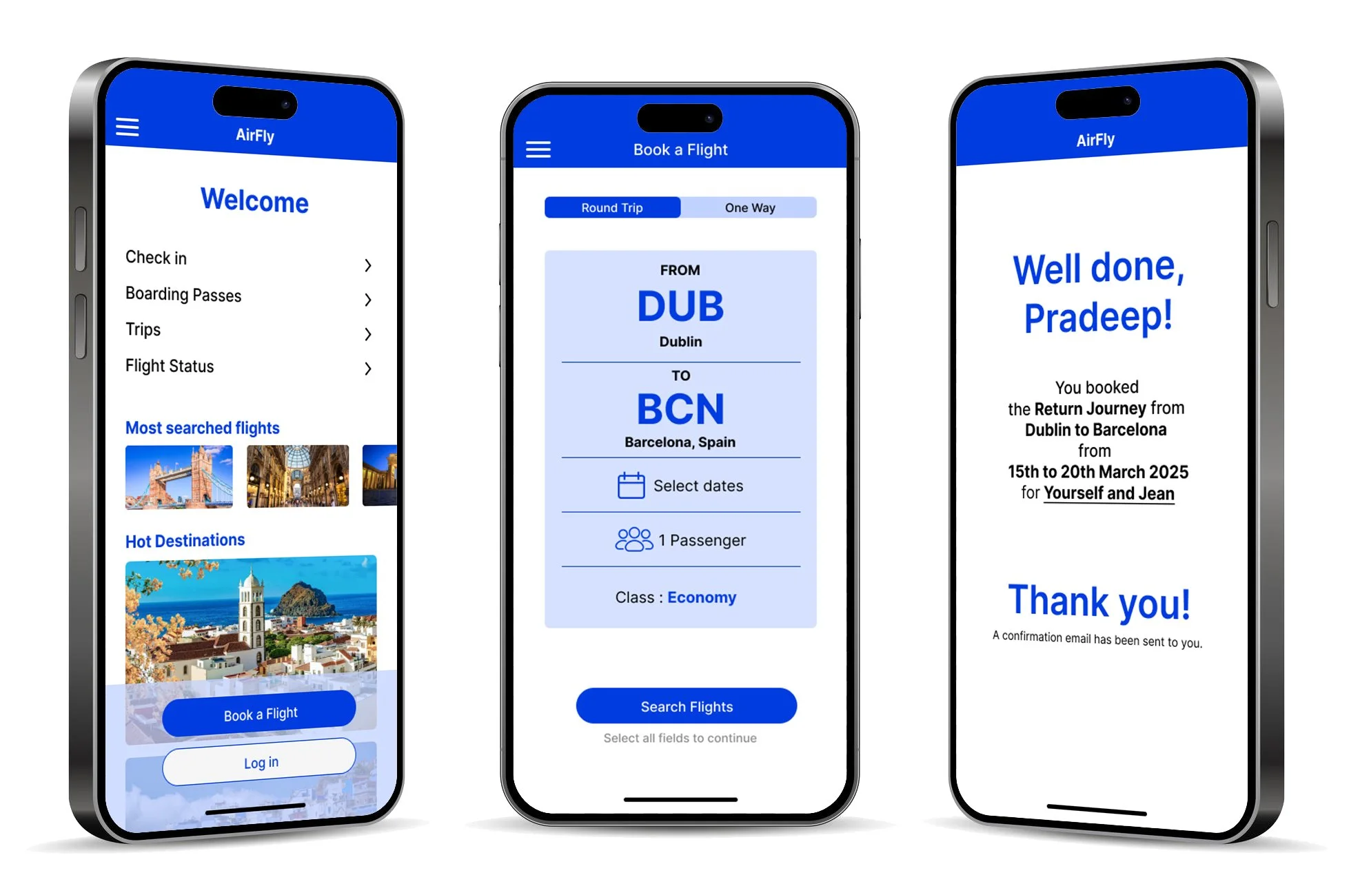
Results
Clearer Information During Booking
Research revealed that users often feel unsure about what they are booking due to missing or unclear information during the process.
Simplified Navigation
Low-fidelity sketches focused on reducing complexity and making the booking flow easier to follow.
Users Need Guidance
Clear explanations of booking details (e.g., baggage or connections) help users make informed decisions during the process.
Real-Time Booking Summary
A summary pop-up was introduced to give users immediate feedback on their selections, helping them confirm choices and stay oriented.
Consistency Builds Trust
Consistent layouts and accessible design reduce confusion and improve the overall user experience.
Foundation for Iteration
These early design concepts provided a strong starting point for testing and refining the experience before moving to higher-fidelity designs.