Groupon
-Spectrum of Experiences
Every day unfolds in gradients.
From the first light of sunrise to the depth of night, life is not defined by single moments—but by transitions. Subtle shifts in time, energy, and emotion. A continuous blending of experiences.
Client: Groupon’s in-house design agency
My Role: Senior Art Director, Team Lead
Tools: Adobe Creative Suite
Overview
Groupon is widely recognised as a deals platform, but its actual offering spans a vast range of real-world experiences—from dining and wellness to travel and adventure.
This project reimagines Groupon as an experience-first brand, shifting the perception from transactional savings to identity-driven discovery.
The Challenge
Groupon’s brand lacked a cohesive system to represent its diverse offerings and emotional value.
The platform spans multiple categories, but the identity felt fragmented
Existing branding focused on function (discounts), not meaning (experiences)
Modern users seek brands that reflect who they are or aspire to be, not just what they buy
My Approach
1. Reframing the Brand
I repositioned Groupon as a platform that enables experiences across all aspects of life—from everyday moments to extraordinary adventures.
Insight: People don’t just buy deals—they buy who they become through those experiences.
2. Building a Multi-Sensory Concept
I developed a conceptual framework based on human senses and experiential dimensions, translating abstract experiences into a structured design system:
Flavor & Taste → Food & dining
Heat, Light & Sound → Entertainment & activities
Texture, Aroma & Feel → Beauty & wellness
Height, Depth & Exploration → Travel & adventure
This allowed the brand to connect emotionally while remaining system-driven.
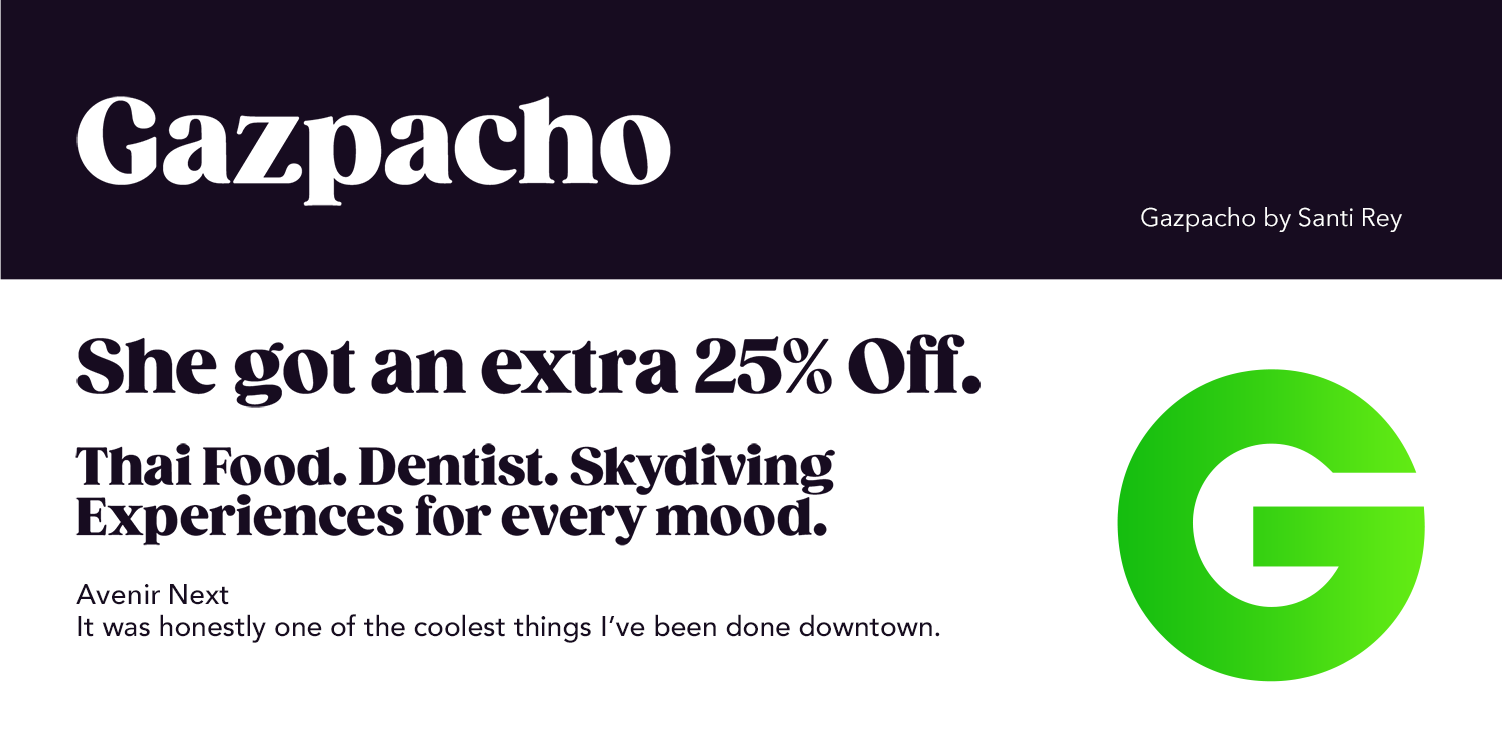
5. Developing a Unified Form & Iconography
I introduced a circular/elliptical visual motif derived from the “G”:
Acts as a flexible container for imagery and colour
Symbolises inclusivity and continuity
Creates a recognisable and ownable visual language
Design Goal
Create a unified, scalable brand system that captures the breadth, emotion, and sensory richness of Groupon’s experiences.
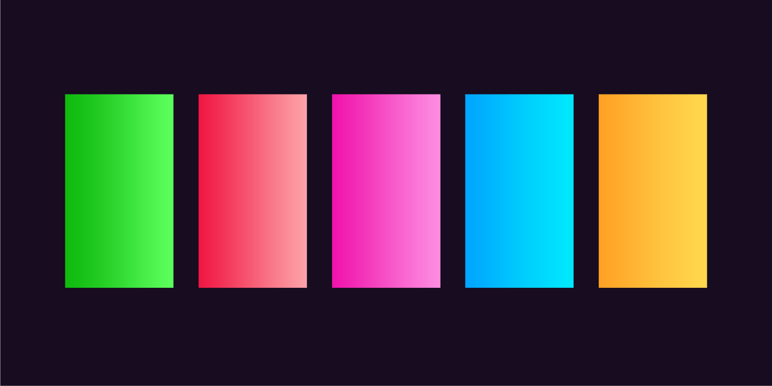
3. Designing a Gradient-Based Visual Language
Gradients became the core visual device to express:
The flow of time
(sunrise → sunset → beyond)
The diversity of experiences
A sense of continuous discovery
This reflects the idea that every interaction with Groupon marks the start of an experience.
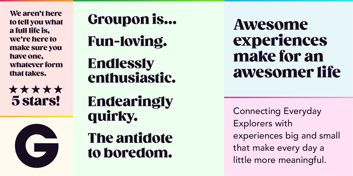
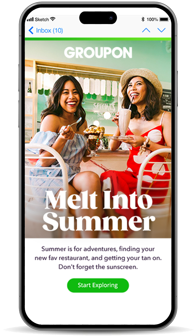
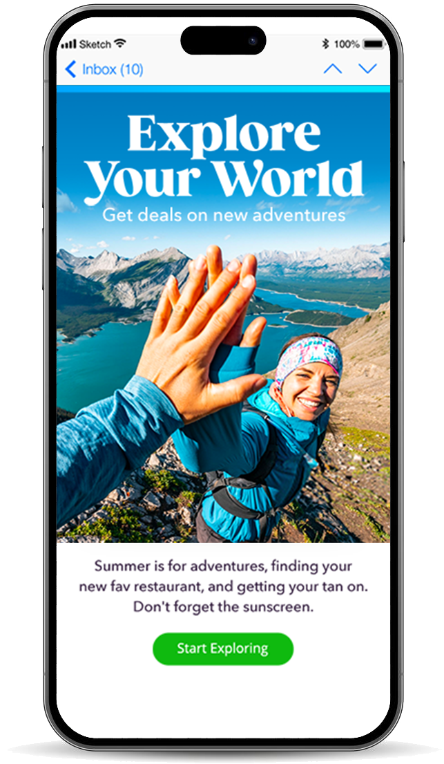
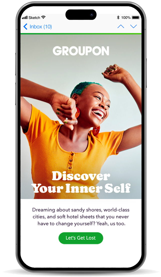
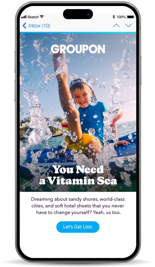
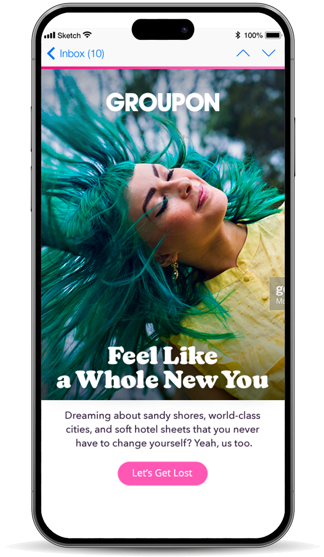
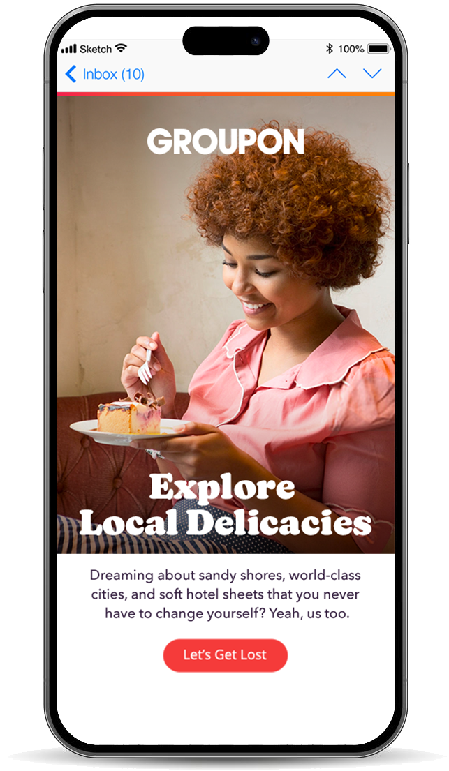
6. Applying the System Across Touchpoints
The identity was extended into:
App UI and promotional placements
CTA systems with category-based colour coding
Marketing visuals focused on experience-led storytelling
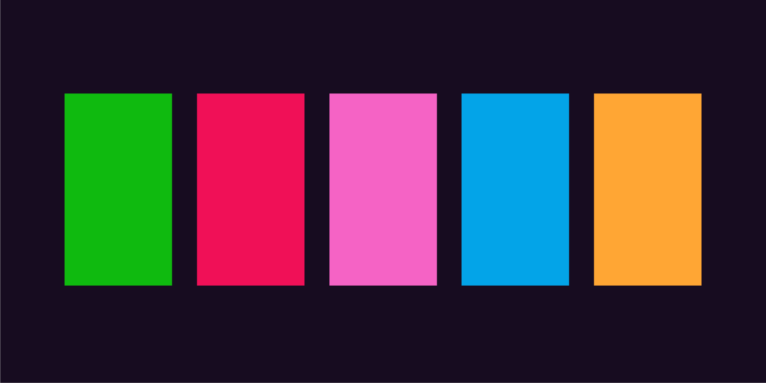
4. Creating a Modular Colour System
Each category is assigned a distinct gradient palette:
Enables quick recognition across categories
Maintains consistency while allowing flexibility
Scales across product, marketing, and UI